Hello. We like to collect well-designed vintage pottery (and lots of other stuff) from the 1950s,
'60s and '70s. Here are some pictures and info of a selection of the things we've found.

Tuesday 13 December 2011

Another Vintage Tupperware find. And guess what?


Just before I get back to doing blogposts about pots, I thought I'd share this seasonal find with you. I wasn't really looking to pick up any more vintage Tupperware but when I came across this little box with a Christmas tree lid recently, I couldn't resist it.

I assume from the colour that it's part of the Harvest range. Remember this: Vintage Harvest Tupperware

Not sure if the Christmas tree impression in the lid is purely decorative or if it was designed to be used as a mould or a cutter. I have a feeling there were other lids like this – possibly a heart and a star.

As with most vintage Tupperware, it's well made, strong and works as well today as it did when it was made.

Friday 9 December 2011

Just for you, selfsewn.


Following some kind comments on my previous blogpost, and a request from selfsewn here are the buttons.

Thursday 8 December 2011

Vintage Quality Street sweet tin. Happy retro Christmas.


In summer, I visited a local second-hand sale. After an hour searching through all the stalls, the only thing I bought was an old tin filled with buttons. The buttons cost just £1.00 but it was the tin that had caught my eye. Now December is here, I thought it would be good time to show it on the blogsite.

The tin is an old sweet tin, most likely from the 1950s or early 1960s. Produced for Mackintosh's Quality Street (still going strong today), the tin is decorated with some excellent vintage graphics. The colour combinations are perhaps not the most obvious, mid-blue, pale-yellow, pink and black but they somehow work together and they certainly evoke the era. A nice detail is the row of Christmas trees round the rim of the lid – remove the lid and another layer is revealed.

A nice tin. Sweet and quality, you could say.

Thursday 1 December 2011

Einar Johansen leaf dish.


Moving away from the bright, bold and beautiful of Delphis pottery, here's a little dish with a touch more subtlety.

It only measures 4 inches (10.5cm) square but for its size, this little pin tray is big on good looks. it's heavily built with chunky side walls, its colours are intense and earthy, and the impressed leaf design in the base gives it an added element of style.

The dish was designed by Einar Johansen. It was made by Soholm, Denmark and dates from the 1960s. Einar Joahansen is probably better known for his blue series of vases and dishes but I think this little pot is every bit as good. It is certainly in the Scandinavian style. It may be the impressed motif in the base, but in some ways it reminds me of the work of Jorgen Mogensen for Royal Copenhagen.

I've listed quite a few bits of Soholm pottery in the past, you can see some of them here: Soholm pottery

Wednesday 30 November 2011

More Carol Cutler. Delphis dishes for Poole Pottery.


To continue the theme of the previous blogpost, let's have a look at some more of Carol Cutler's excellent work. The large charger and the smaller dish on the left were both painted by Carol Cutler sometime in the late 1960s or early 1970s. I think Carol was working at the Poole Pottery between 1969 and 1976.

All three are from the Poole Pottery Delphis range. The two smaller dishes measure just five inches (12.5cm) in diameter and are both stamped with their shape number – 49. I'm lucky enough to have a couple of these pocket-sized little treasures but if you want to see an amazing collection of Poole '49ers', Rob has a stunning gallery, here: Rob's 49ers

I've had these three pots in the collection for a good number of years now and I never seem to tire of the free, expressive, abstract patterns. In fact, with the passing time, they seem to be growing on me. Subtle, they're definitely not. Colourful, brave and full of energy, they certainly are.

Thursday 24 November 2011

Poole Pottery Delphis vases. Not giving up.


If you wanted to add an instant splash of colour to a modern interior, you couldn't far wrong with a piece of Poole Delphis pottery.

Poole Delphis is bold and bright and stylish. I think it's fair to say that the popularity (if measured by the going value) of Delphis has dipped a little over the last two or three years. But I, for one, am not giving up on it. I think Delphis is brave and exciting and has the ability to deliver a great big dose of artistic style to any room.

The Poole Delphis pots shown here all date from the early 1970s. The red vase was decorated by Pamela Bevans, The green pot is by Carol Cutler, and I haven't yet identified the pot on the left.

Anyway, I love them whatever has happened to their market value. With me, it must be a case of 'value is in the eye of the beholder'.

Monday 21 November 2011

Baca vase by Nils Thorsson for Royal Copenhagen


Is it going a bit too far to describe a vase as sheer joy?

I don't think so. Not when the vase is as good looking as this.

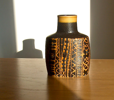
This perfectly formed bottle vase is the work of Nils Thorsson. Made by Royal Copenhagen, Denmark in the 1960s, it's part of the Baca Fajance series.

The intricate yellow trails of linework stand out against the deep brown background and the whole pot has a lovely 'orange peel' textured surface.

The vase has been in the collection for several years now. I was lucky enough to find the vase in the early days and managed to pick it up without paying too much. And I think I can honestly say it's been a real pleasure to have this vase on display.

Saturday 19 November 2011

Carn Pottery Chimney vase, 1970s.


In October I did a blogpost on Carn Pottery, you can see it here: Carn Pottery. Growing up fast. As a follow up to that, here a couple more examples of that nicely textured pottery from Cornwall.

The top picture shows a vase known as the chimney vase. Designed by John Beusmans in the 1970s, the vase is really comprised of two boxes joined together, the tallest is open at the top to take a sprig of flowers. The vase is decorated with a wonderful, organic texture.

The second picture shows two more Carn vases, this time probably from the 1980s. Known as the box vase and the orb vase, they both have attractive abstract designs and that lovely Carn textured surface.

No wonder Carn Pottery has found so many new followers. It's so good to look at – and just asking to be picked up and touched.

Saturday 5 November 2011

Pisces fish vase Hornsea, 1961.


And last, but not least, in the mini fish series, are two extraordinary vases (or should that be works of art?) known as Pisces.

To me, this is an example of how an item of pottery, in this case a vase, can be elevated, through its design, to a level where it can justly be regarded as a work of art.

In other words, I like these vases.

This is Pisces, designed by Ron Mitchell in 1961 for Hornsea Pottery. Stylised fish are carved into, and sculpted onto, the surface of the vases, and an abstract surface pattern in earthy neutral colours provides the perfect background to the white fish shapes.

As these vases were made in very small numbers, they are now difficult to find. There were three different shapes made. As well as these two, there's a third, taller vase, an example of which is in the V&A Museum, London – you can see that one here: Hornsea Fish Vase at the V&A , and there's another example on the excellent pottery website Retroselect: Pisces at Retroselect

Graphic, sculptural and pleasing to the eye, these vases really are a pleasure to display.


Friday 4 November 2011

Fish from Norway. With Clupea by Turi


I think the fish on these cups are Herring.

This wonderfully drawn design features simplified fish illustrations in blues and greens. They are part of a range by Figgio Flint, Norway known as Clupea and were produced in the 1960s. The design is by Turi Gramstadt Oliver. The matching saucer is a square shape which is a nice touch.

Thursday 3 November 2011

Red fish shaped dish.


So, to continue the fishy theme, here's one I caught recently.

This small fish-shaped dish is quite nicely made. I don't know a lot about it really. I suspect it could be from Italy. Perhaps it was made as a tourist gift item around the 1970s. Even so, the strong colours, fine line work and the addition of the white slip dots make it a pleasing object to look at – so into the Potshots collection it goes.

More fish coming soon.

Tuesday 1 November 2011

A shoal of fishy dishes from the 1950s.


Pottery fish are a bit of a favourite of mine, and fish seem to have been a bit of a favourite at Hornsea Pottery too.


These fine examples are from a range made in the mid 1950s by Hornsea Pottery. They are made in the form of small, shallow dishes and they come in various sizes and colours. One nice feature of these little fishy dishes is that they all have a hole on the reverse so that are that they can be hung on a wall – a bit like pottery flying ducks, I suppose. The decoration was formed by using trails of liquid slip and dragging the spike shapes with a fine tool.

These little dishes look so good, I feel inspired to go on a fish-based blog-run. So stand by for a couple more fish themed pots over the next couple of days.

Wednesday 26 October 2011

Denby Arabesque. A lasting impression of the 1960s


Without doubt, Denby pottery is made to last. And if these items are anything to go by, it certainly does.

This is a range of tableware called Arabesque. Designed by Jill Pemberton for Denby in the 1960s, the items are so well-made in a hard Denby stoneware that they seem to be virtually indestructible. Even after so long, they don't look to have any real signs of wear or use. In a way, the design too has withstood the test of time. Even though the shape and surface painting is very much in the style of the '60s, they somehow retain their appeal and freshness today.

As I have quite a few examples of Arabesque in the Potshots collection now, I have recently passed a few bits on for others to enjoy by way of Ebay.

Thursday 20 October 2011

Louis Hudson lamp base. Another Cornish gem.


Following on from my earlier blogpost on Carn pottery, this rustic, earthy looking ceramic lampbase is another nice example of studio pottery from Cornwall.

Made by Louis Hudson, probably in the 1970s, the bottle shaped lamp base has a wonderfully textured design of raised and impressed motifs. I particularly like the warmth of the clay colour and the restrained use of the glazes.

For more information of the studio potteries of Cornwall there's an excellent digital museum here: Cornish ceramics museum. The site has an excellent maker's marks section for identifying pottery from the region.

Monday 17 October 2011

Portmeirion storage jars. Simplicity is the key.


Made by Portmeirion Pottery in the late 1960s or early 1970s, these two large storage jars were designed by Susan Williams-Ellis.

The pattern is Greek Key. As regular visitors to Potshots will know, I'm a bit of a sucker for cylinder-shaped pots, like these: Cylinders on Potshots and these: more cylinders, I think I must be attracted by the simplicity of them. Another nice feature of these vintage storage jars is the way that the bands of black printed borders are confined to the very top and bottom of the jars - leaving lots of that bright coloured body showing in between. The nicely turned wooden lids fit snugly and the contrasting bright orange and lime green colours seem to work well when displayed together.

Monday 10 October 2011

Carn pottery. Growing up fast.


Troika pottery, from Cornwall, has had a spectacular rise to fame over the last decade or so. It's grown to become one of the most collectable, sought-after ranges of UK studio pottery. I must admit, I'm a big fan myself – as you can see here Troika on Potshots and here more Troika.

But Troika has a sort of little brother. Not really a poor relation, and not a poor man's Troika by any means. Carn pottery, also from Cornwall (Penzance), is growing up fast. It's not surprising that Carn pottery is becoming increasingly popular. there are some very nice items in the range.

Subdued colour schemes, textured surfaces and panels of abstract design all combine to give a sense that these attractive studio pots have a real hand-made, hand-crafted quality.

As Carn pottery is still quite reasonably priced, it may be a good time to pick up a couple of carefully chosen pieces. Who knows, one day it may enjoy some of the fame that Troika has had.

The vase shown here probably dates from the early 1970s.

Monday 3 October 2011

Rorstrand Red Top.


Elegant details, subtle graphics and a simplicity of form. All combined to give this understated range a timeless appeal. I love the way that the black and white colour scheme is punctuated with that bold dash of deep red.

This is Red Top, designed by Marianne Westman for Rorstrand, Sweden. Made in the 1950s, Red Top somehow manages to be typical of the design style of the 1950s, and also still be modern-looking today.

Looking at websites that carry images of Marianne Westman's work, it would seem that Red Top and other ranges by the designer are much admired in Japan. I wonder if it's the purity of style that appeals to collectors there. It's certainly one of my personal favourites.


Friday 30 September 2011

Fish wall plaque from 1972.


I like the dark, cool colours on this circular wall plaque. The stylised fish in the illustration looks as if it's moving through deep water.

The circular plaque is made from dark brown clay and the glazes have a subtle textured look. I have an idea that there were several versions of this plaque, each with a different coloured background and different illustration.

The plaque was made in 1972 by Hornsea Pottery. It's described by Hornsea as a wall plaque but I suppose it could also be used as a teapot stand.

Either way, it's a stylish bit of retro design.

Monday 26 September 2011

Mdina glass vases


I seem to have strayed off into glass recently, so I thought I'd continue the theme with this quick blogpost on a couple of Mdina vases.

I occasionally come across Mdina glass on my travels, some of it is little bit ordinary but some of it looks quite good. I like the vases with simple shapes best. I think the flat tops on the necks of these two vases are a nice touch. The green and sand colour scheme seems to be very typical but I also like the more subtle, simplified colour scheme of the larger vase.

I have some more Mdina vases and hope to do a blogpost on them sometime soon.

Mdina glass was produced in Malts. I would say these vases date from the mid-1970s.

Thursday 22 September 2011

Scandinavian glass vases. Easy on the eye.


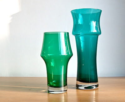
I found a couple of coloured glass vases recently. I was attracted by the simple design and softly curved shapes.They were very reasonably priced so, even though I didn't know who they were by at the time, I decided to buy them.
The vases look good on display. It was only later that I did some research on the vases and discovered that they are Scandinavian. From Finland, actually. The vases were made by the Riihimaki or Riihimaen glassworks, I would think in the 1970s. I'm not certain but I think they may have been designed by Tamara Aladin.


I have a feeling that, now I have these two, I'll have to add more – if I can find any.

Wednesday 21 September 2011

Hornsea slipware vases. Smart zig-zags from 1963


Elegant shapes, cool pastel colours, and simple zig-zag designs combine to make these vases so distinctive - and so stylish.

They were all made in 1963. Known as Slipware vases, they were made by Hornsea Pottery. Each has a painted grey band which is hand-decorated with those fabulous zig-zags in white slip clay. It's nice to display a single vase on its own but they look even nicer when displayed in groups. I can't decide if groups of mixed colours look better or groups of vases all in the same colour. I suppose it would depend on the decor of the room. Either way, I love these vases. In my opinion, this Slipware range is one of the best looking designs ever to come out of Hornsea Pottery.

Wednesday 31 August 2011

These Hornsea Beaded pots deserve a closer look


This delicate surface pattern is known as Beaded. The pots are by Hornsea Pottery. The graphic designer, I think, is Jack Dadd. The range is from the early 1970s.

To me, the design has a wonderful lace-like quality and the black linework on the ivory-coloured background looks clean and bold. The look is further enhanced by the slight irregularities that occur in the hand-drawn design.

I understand that the range was not a good seller for Hornsea. It's a pity. Because I think this is a design that deserves a closer look.

I found another example of Jack Dadd's work in the V&A museum. You can see it here Jack Dadd mug

Wednesday 24 August 2011

Limoges. A miniature plate with a mysterious Paris scene


I found this tiny little china plate and, to be honest, it's a bit of a mystery to me.

The plate measures just over 6cm (2 and a half inches) in diameter and is marked Limoges, France on the base.

The plate has a stylish illustration of a Paris street scene at night. But what is going on? A man walks with his hands in his pockets past a shop window. A lady stands, smoking a cigarette, in the pale yellow light of a street lamp.

I've seen lots of Limoges china plates before, many are decorated with classical romantic garden scenes by Fragonard. Although they are quite decorative, they don't really fit in with my collection.

But this Limoges plate, I like. So if you do know anything about it, I would be delighted to find out more.

Wednesday 6 July 2011

A Scheurich vase with subtle decoration. Surely not?


Just a quick blog-post to show you this good looking vase from West Germany.

I'm fairly sure this is by the Scheurich factory. I would say that the vase dates from the 1970s. As far as these West German vases go, this one has quite a restrained, dare I say subtle, decoration. There are repeated motifs in red 'lava' glaze on a deep blue background.

Collectors of 'fat lava' seem to have waited a long time for it to happen, but I get the feeling that this type of pottery is slowly becoming desirable and that prices are beginning to gradually rise.

For more detailed information on West German pottery and some great pictures, there's an excellent blog here: Blurat blog

Wednesday 29 June 2011

Soholm Joseph Simon wall tile. What a relief.


One of my first blog-posts on Potshots was on a selection of ceramic wall tiles by Soholm, Denmark. Some were designed by Noomi Backhausen. You can see the original blog-post here: Soholm wall plaques

Here's another Soholm wall tile, this time designed by Joseph Simon. I would say the tile dates from the mid-1970s. The simplified and stylised illustration is wonderful and the rich red and blue glazes are intense and rich. One really striking aspect to this wall tile is the depth of the relief molding. There's a real three-dimensional feel to the tile. When it's displayed on a wall, it gives an impressive effect – a piece of art that's both a picture and a sculpture at the same time.

I have this wall tile hanging in my work room and it's a constant pleasure.