Hello. We like to collect well-designed vintage pottery (and lots of other stuff) from the 1950s,
'60s and '70s. Here are some pictures and info of a selection of the things we've found.

Thursday 27 December 2012

Three Scheurich retro winter warmers

 
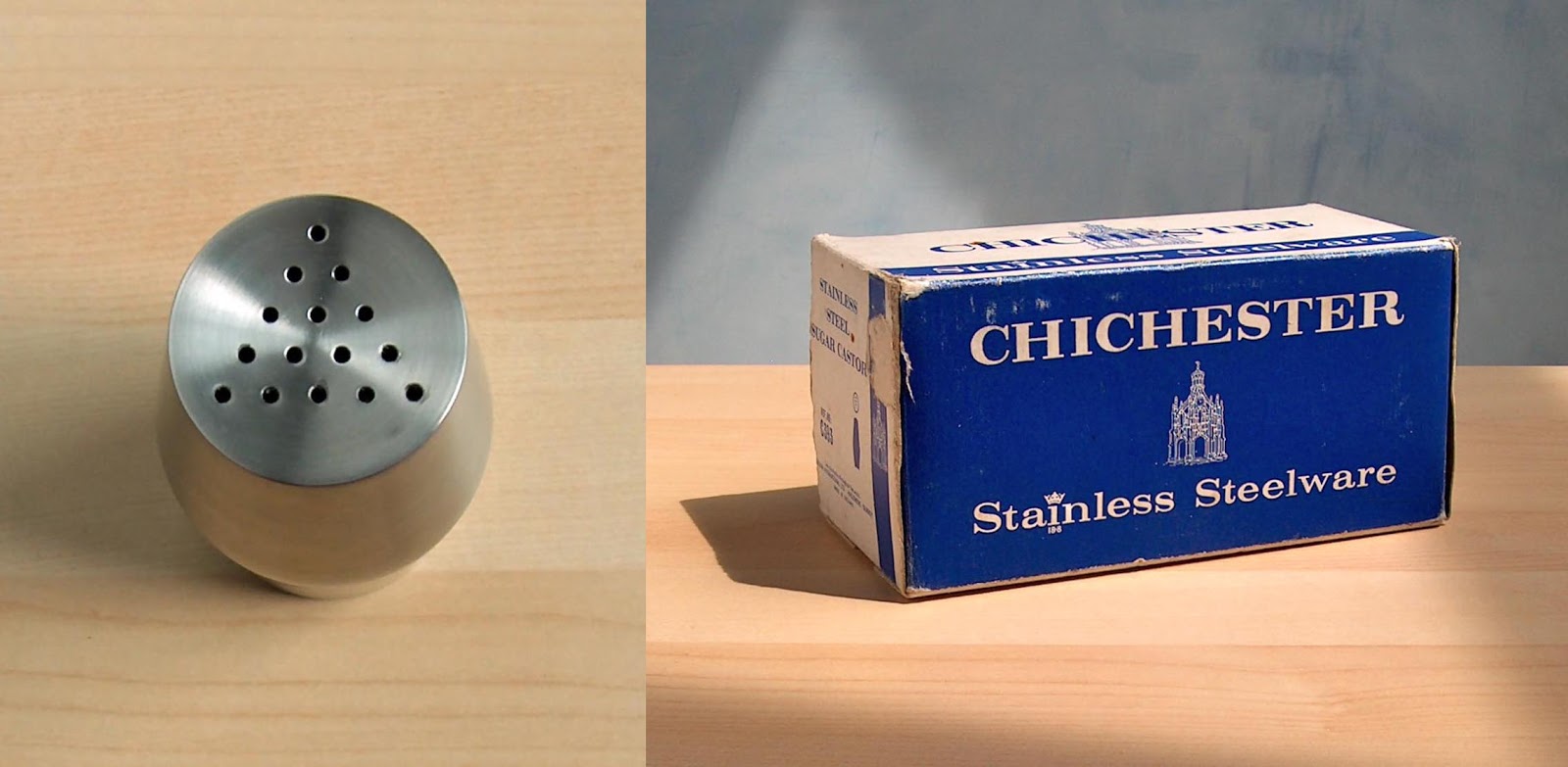
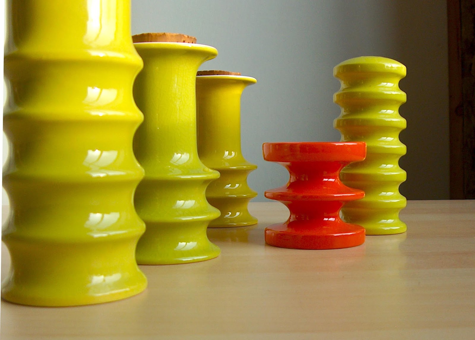
Something to add a bit of warmth to a winter day.

There are Dancing flames, fire-red colours and bubbling lava flows on these vintage West German vases.

I have an idea they are all by Scheurich and they probably date from the 1960s or 1970s. Grouped together, they certainly help to warm up a retro-styled interior.

There seems a lot more information available on West German pottery these days - and some very keen collectors. There are some amazing images and lots of good info on one of my favourite blogs, here: Blurat West German pottery

Saturday 22 December 2012

Sweet simplicity in stainless steel.


Who was it that said 'Less is more'?

Do you find that sometimes, when you see and an object, it looks and feels just right? It may not be an expensive object – like this humble sugar shaker – but somehow you get the feeling that the designer got it spot on.

I do. And I did, when I found this stainless steel kitchen accessory in a local charity shop recently.

I suspect that simplicity is the key. And I imagine that it's not easy for a designer to get that just right: keeping to a perfectly symmetrical form, resisting the urge to add any decoration and carefully considering every small detail right down to the arrangement of the holes in the top. Simple but not easy.

As for the sugar shaker itself, all I know of it is that it was made in Britain by Chichester, I would guess around the late 1960s or early 1970s.

Sweet.

Thursday 13 December 2012

Troika. A work of art whichever way you look at it.


Vase, sculpture, art? To me, this tall Troika vase qualifies as all three.

And the nice thing about having a vase that's square like this one, is that – depending which face you choose to display – it's a bit like having four different vases in one.

This carved and wonderfully textured vase in warm earthy colours is by Troika Pottery. The design is by Tina Doubleday who was at Troika between 1977 and 1979.

There's a lot more information on Troika pottery, including a useful list of designers marks, here: Troika Pottery

Friday 30 November 2012

Colourful and sculptural. 1970s Carltonware.


Back to the pottery. And what better way than with a zing of colour from the 1970s.

These artful creations are by Carltonware and they probably date from the 1970s. In Acid green, lemon yellow and bright red, this tableware looks wonderfully sculptural with those stacked ring shapes. There are two vinegar or oil bottles, the small red item is a candle holder, the round top item is a pepper pot and the tallest pot is a vase.

Even if you didn't want to use them on a table setting, I think they look so good together as a group, you could simply put them out on display and enjoy them as little works of art.

Friday 9 November 2012

The talent of Charley Harper


I recently did a blog-post on the illustrations from a Mary Blair children's song book, remember this: Mary Blair book ?

Well, I was lucky enough to get hold of a copy of another superbly illustrated children's book and I couldn't resist sharing it with you too.

The book, a children's introduction to biology, was published in 1962 and it features the illustrations of the brilliant Charles Harper

The book is jam-packed with illustrations – these six scans are only a small sample. There's no need for too many words from me on the superb quality of the work, the pictures speak for themselves, but it's worth remembering that they were all produced long before the use of computers in illustration.

Tuesday 30 October 2012

Italian lamp bases. This Bitossi pair will soon to see the light.


I suppose it's criminal of me not to be using these smart Italian lamp bases. Both have fittings and are fully wired – they just need a plug and a suitable shade and they'd be ready to go. It's a shame not use them so I promise to get that done soon.

The lamp bases are a couple more examples of vintage Bitossi pottery from circa 1960s or 1970s. As regular visitors will already know, like a moth to light, I seem to be helplessly attracted to cylinder shaped pottery – remember this: Cylinder vases

The Bitossi factory is probably more associated with the Rimini Blue pottery but they also made some fabulous items in reds, yellows, oranges and other colours. The orange and brown lamp base shown here has the characteristic bands of impressed motifs that are used on the Rimini Blue range and that give such a wonderful surface texture.

Thursday 25 October 2012

Rainbow cruets from the 1960s.


I recently did a couple of blogposts featuring Hornsea Rainbow pottery from the early 1960s. One of the items was a rather smart cruet set. Remember this: Rainbow cruet

The salt and pepper pots shown in that blogpost were in the Roulette shape – one from a range of five different shapes. So just to complete the Rainbow cruet story, here are the other four shapes made. I think the names are, from left to right:

Top row, Cone, Crinoline
Bottom row, Globe, Parasol

And just to remind you, the set shown below is in the Roulette shape.

Wednesday 24 October 2012

Fishy Fellas from the Fifties


And now, as they say, for something completely different.

Admittedly not something you might expect to see on a blogsite like Potshots: I suppose I've been trying to steer away from showing too much 'cute' pottery. Even so, I think these fishy fellas deserve a mention. Not least because in my view, they do have an element of style about them.

Made in the mid-1950s, they are in the form of small posy vases, the tall one has a hole in the back and is designed to be used as a wall pocket. The green one is made from a slightly coarser red clay rather than the usual white. Each one has a stylised fish sitting in front of a wave shape. They were made by Hornsea Pottery and are part of the Fauna range.

I quite like the shape of the fish, and the wave does have some nice flowing curves in it. In fact, the tall vase has such elegant lines that it almost has an Art Deco quality about it.

Tuesday 23 October 2012

Murano faceted vases c.1970s.


Italy again. This time in the form of some crisp glassware.

These vibrant, geometric vases are from Murano. They are probably by the Mandruzzato glass works and I think they were made in the early 1970s. Eye-catching they are too, with cased layers of red, gold and clear glass. The polished, faceted surfaces give a cold, hard feel and an ultra-modern look of purity.

Although Murano faceted vases were made in various colours, I particularly like these bright red examples.

There's lots more information on faceted glassware (and other 20th Century glass) here: Mandruzzato glass

Friday 12 October 2012

Rimini Blue vases by Bitossi. Rediscovered


Last week I had to clamber up into the loft space to bring down some suitcases. Whilst I was up there, I couldn't resist peeping into a couple of storage boxes that I put up there two or three years ago. Look what I found in one of the boxes: this selection of wonderful Italian pottery. As I hadn't seen these since the day I'd stored them away, it was like meeting a long-lost friend again.

As far as I know, the range is known as Rimini Blue (or Rimini Blu) and they were made in Italy by Bitossi. Dating this type of pottery is a little more difficult. I have a feeling this range has been produced since the early 1950s, but that some items are still in production today.

The shapes, the fabulous blue/green colour, and the textures are all a joy on the eye.

I have a feeling I have some examples of Bitossi pottery in reds and oranges put away somewhere – I can feel another trip to the loft coming on.

Tuesday 9 October 2012

Sienna by Jessie Tait, 1960s


Some more examples of transfer printed pottery from the Midwinter range.

This graphic, three-colour pattern is Sienna. Designed in the 1960s by Jessie Tait, it features slabs of colour in greenish ochre and orange overlaid with a fine lattice of black linework. 

In 1962 Midwinter introduced the Fine shape for dinnerware. Sienna was one of the first designs to be used on the new shape. The pattern proved to be very popular and was still in production up to 1978. 

As there were so many items made, Sienna is not a particularly rare design – even so, it's still one of my favourites.

More on Jessie Tait here: Jessie Tait  and here: Jessie Tait collector

Friday 28 September 2012

A homespun delicacy from the 1960s


I promised to show some more Midwinter pottery. And to continue the theme of good looking printed surface design on pottery, here we have a nicely decorated Midwinter platter.

Produced in the 1960s, this pattern is known as Homespun. It was applied to a range of dinnerware in the attractive Fashion shape. The flatware carried this check design, the holloware (cups, jugs, sugar bowls, etc) that accompanied the set came in an all-over ochre colour.

I've included a close-up photo as I think it's worth taking a closer look at how delicately the line work in the design was drawn.

Friday 21 September 2012

A bit more Midwinter Cassandra


Dashing about a bit today so not much time to do a proper blogpost.

Just time to post a few more pictures of the Midwinter Cassandra range. And to share a link - there's some good information on the history of Midwinter pottery, here: Midwinter history

Sunday 16 September 2012

Midwinter Cassandra 1957


Graphics and surface pattern design have always been a fascination for me. And you can find some amazing designs on ceramics.

So to kick off this little run of non-Hornsea pottery, I thought I'd show a couple of examples of pottery that feature interesting printed designs. This plate by Midwinter pottery is a good one to start with. It features the Cassandra pattern, designed in 1957. The range is transfer printed with an elegant two-colour abstract design with a hint of leaf motif.

I like the Cassandra range. The design seems to me to be so typical of the era. It's cleverly drawn, too. The black outline on the design is made from one continuous line.

I'll try to show some more Midwinter soon.

Wednesday 12 September 2012

Multicoloured slipware from 1961


More slip decorated pottery, and more Hornsea Pottery. (I promise to find some non- Hornsea pottery to show you after these).

These funky vases feature a whirly, swirly design in bands of contrasting colours. Known (for obvious reasons) as multicoloured slipware vases, they were made by Hornsea in 1961.

I think there were four vases produced in this range with slight variations in size and shape. I like them because as a result of the hand-made application of the design, each pot is unique, an individual creation, and no two pots are alike.

OK, no more Hornsea for a while.

Wednesday 5 September 2012

Studio slipware pin dishes from the 1950s


I don't really have much need for a handy supply of pins but if I did, I'd keep them in a dish like this.

These Stripe-tastic pin dishes were made between 1954 and 1957. Known as studio slipware the dishes were made by (you've guessed it) Hornsea Pottery.

The flared black and white stripe design is hand-applied in coloured slip. The softly-curved rectangular dishes are nice, they stand on a base with four small feet.

There's more Hornsea studio slipware on Potshots here: Studio slipware

Wednesday 22 August 2012

Hornsea Rainbow salt and peper set. 1960s


More Hornsea Pottery from the Rainbow range. Again made between 1961 and 1963, this is a salt and pepper set. I think there were five different shapes of Rainbow salt and pepper sets and I have a feeling that this shape was called Roulette. If I find any more of the shapes, I'll let you know.

Tuesday 21 August 2012

A Rainbow for Summer, 1960s style.


Although only small - the largest is only three and a half inches (9cm) high - these mini vases are certainly big on 1960s style.

Made by Hornsea Pottery between 1961 and 1963, these colourful little pots are from the Rainbow range. The fluted yellow bodies are decorated in hand applied horizontal bands in black, red, grey and pale blue.

I particularly like the shape of the two vases shown in the close-up photos, they seem to have a sort of Japanese feel about them.

Perhaps the bright yellow colour would be a bit tricky to fit into today's colour schemes, but a display of Rainbow pots wouldn't half add a splash of colour to a room.

Sunday 24 June 2012

Kitty number two. The Hornsea Marion Campbell cat.


Kitty number two.

Again a stylised cat with an elongated neck and nicely painted features.

This time, I can give some background information. This cat (is it a Siamese?) was designed by Marion Campbell for Hornsea Pottery. It was made in 1961 or 1962 and is one of a set of five similar cats in different sizes. This version is the second-largest of the series and is about seven and a half inches (19cm) high.

Aren't those exaggerated cat eyes fabulous?